NOTE: You should avoid the suggestion below, if data in the columns can be too wide for the available width and force a line break. If this line break may force a page break, then the columns might be incorrectly positioned on the following page as the leftmost containers are not used on the new page before they are inserted. A better alternative is to use a table to setup fixed columns.
The section, Options for handling detail lines lists other (better) suggestions.
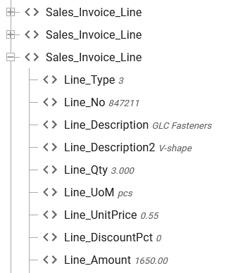
Here I use this XML file as input:
(You can find that in the document LIbrary of InterFormNG2 under Demo/Demo_invoice.xml).

If you want this output:

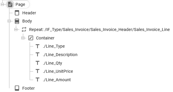
Then you can define your template like this:

In this setup the Container is setup to use Row as the Flow direction, which is setup here:

We set the dimensions of the container to be dynamic in both directions.
With this flow direction the texts are placed beside each other, but now we need to set a specific width for each text in order to output columns, that have the same width independently on how wide the specific text is:

It is a good idea to only set a fixed width and use a dynamic height on the texts as this will make the container expand in the height to the required height depending on the font size used.
If you want more space between the texts, then you should consider to add a margin to the texts.
If you want to insert multiple output lines within the container, then you should consider to insert the Line break element, which you can find as indicated below:

(Please notice, that the line break element can only be inserted within a container, that has Row as the flow direction)
You can also use the line spacing option on the text to add relatively more space in the vertical direction. The line spacing is setup on the text here:

Advantages
1.The height of the row in the table will as default adapt to the height of the dynamically positioned contents. That means e.g. that if you later change the font size or if the texts can be multi-line texts, then the table will handle this without any issues.
2.If you right align texts, then they are shown in the correct position in the result view.
3.If you change the width of a text, then all texts to the right of it will be moved accordingly.
4.It is easy to change the order of the texts.
5.If you insert a new text in the middle of a row, then all texts to the right of it will move accordingly.
Disadvantages
1.You cannot reposition/drag the texts. If you do that (and make the text to be fixed positioned), then the texts no longer has any effect on the row height.
2.You need to type the width of each text manually.
3.You cannot align multiple texts with a click on an alignment option. You need manually to set text widths to match them up.
Tips
1.Remember, that you can use the margins of a text to add more space between the columns.