This section contains an introduction to the InterFormNG2 designer.
First you of course need to start the designer.
You probably need to load some resources e.g. input files, images, fonts etc. That is loaded via the Library.
Some default designer/template settings can be set under the tenant settings. This includes template defaults and colors and fonts.
Now you can either create a new template or open an existing template as described below:
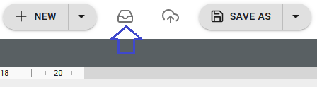
Open an existing template
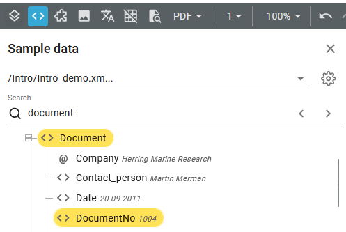
To open an existing template in the designer you can either click the template in the Library, or you can click the marked icon on the upper right in the designer:
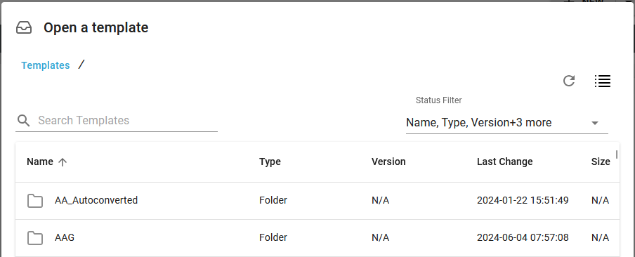
Next to the magnifying glass you can enter a search text. If a text is entered then only folders and templates that contains this text are shown. The search is only done on the folders and templates, that are currently shown. If you e.g. have a template in sub-folder, that match this search, then this template will not be shown.
The header of the designer looks like this:
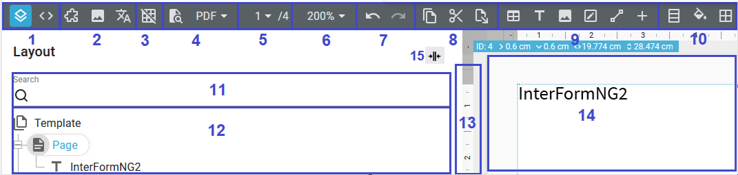
The marked areas are described below:
The 11 selected areas are described below:
1.Left view
With these two icons you can change the view on the bottom left, where section 9 and 10 are shown. If you click the rightmost icon: <>, then you can load a sample input file (XML or a spooled file), that can be used for your design.
So with the leftmost icon you see the list of element in section 10 (where you can search for a text in option 9). With the rightmost icon you can view the sample input file. For input XML files you can simply drag nodes into the result view (section 11), and for input spooled files you can select an area with the mouse, hold down the left <CTRL> key and drag the selected area into the result view (11) to add a text element with the selected data.
You can load a sample input file (either XML or a spooled file) from the documents library if you click the <> icon and then this icon:
Then you can select and load the sample file from the documents folders in the Library or even upload it first from the designer as described in the section below.
It is even possible to edit the sample file after you have loaded it.
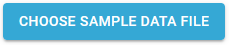
Upload a sample file to the document folders
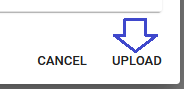
You can also choose to upload the input file into the documents folders directly from the designer, if the input sample file (.xml or .splf) is not found in the documents folders. You can do that, if you select Upload in the lower right corner of the pop up window, if you first click the blue Choose sample data file icon as shown as an image above:
Here you should first select the folder to upload to and then click the upload icon. That will create a new pop up window, where you are to select the file to upload and then click Open.
After uploading the file you can then load the sample file from the Library.
2. Drag resources
This section can be used, if you want to insert each of the 3 element design types in an easy manner. The 3 element types are from the left:
Component: This can be used, if you want to insert selection of common elements e.g. a header or a footer, that is used in many of your designs. To insert a component you can simply click this icon and drag the component into the result view (section 11).
Image: Click this to see the list of all installed images. You can drag an image from this list into the result view (section 11) to add an image to your design.
Translation: Instead of typing all texts, you can consider to use translation files. This makes it possible to create a single design, that can be used for multiple languages. You can e.g. set the default language in the properties of the template element in section 10.
On way to align elements is to use a grid. When the grid is active, the elements snaps to it, if you drag the element in the result view (section 11). You can enable/disable the grid with this option and ýou can set the size on the properties of the template element in section 10.
With these two icons you can with the leftmost icon request a preview. This means, that InterFormNG2 will merge the input file with your current template/design (even though you might not have saved the latest changes - changes to template components need to be saved) and the merged result is shown. As default the preview is shown in PDF.
If you however setup a preview ZPLII or a DP preview printer, then you can preview the merged result via a physical printer. If you have setup multiple preview printers, then you can dynamically choose which of the preview printers, that you want to use for the preview if you select it via this drop down list (after you have selected ZPL or DP as the preview type):
[Object]
For HTML templates you can also set the preview type to be HTML. The rightmost icon sets the file type of the preview via a drop down list.
If a preview fails in the designer (e.g. because of missing resources), then you see a pop up window like below:
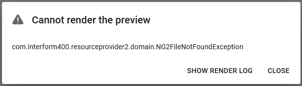
If you now click the link: Show render log, then you can see the details of the error(s) like below:
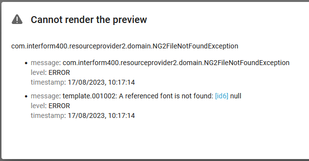
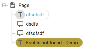
For most errors a link is included ( [id6] above). If you click this link, then you will see exactly which element in the template, that has caused this error. It is highlighted as below:
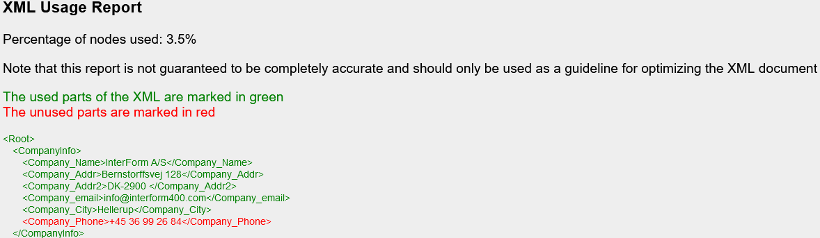
A special preview output format is available in the preview drop down list: XML Usage report. If you select this, then the next preview will list the input XML file with each XML line marked in either green or red depending on the node is used or not - an example is shown below. Please note, that the report may not be 100% correct, but it can be used as inspiration to reduce the data included in the input XML file e.g. for the cloud, where you especially should consider to reduce costs and improve performance allround. A usage report looks like this:
5. Page selection and number of pages
This section displays on the left the current page and after the slash the total number of pages, that is generated with the input file, that is currently selected. In the screenshot above the currently selected page is 1 and the total number of pages is 4. The left side of this area is a drop down list from where you can choose the exact page number, that you want to see in the result view.
Here you can select the zoom of the result view (section 14).
Here you can undo and redo the changes in the designer. You can also use the normal short-cut keys: <CTRL>+Z for undo and <CTRL>+Y for redo.
You can use these icons to cut, copy or paste elements. The rightmost icon for the paste is only displayed if the clipboard contains copied/cut data. The normal keyboard short cuts: <CTRL>+C, <CTRL>+X and <CTRL>+V are also supported. You can select one or multiple element with the normal keyboard options: Hold <CTRL> and select multiple elements by clicking one element at a time or hold <Shift> and click the first and the last element in the element list (section 10 above).
This section contains all the design elements, that you can currently insert and also some settings of the currently selected element in the element list (section 10). Click the ‘+’ icon to see the complete list of elements you can insert at the selected element. All elements are covered here.
10. Properties of the selected element
This part of the header is flexible and it display multiple options for the currently selected design element. This is the element, that you have selected by clicking on it either in the element list (12) or in the result view (14). In the screenshot above the properties shown are some of the settings for the page element. If you e.g. select one or multiple text elements, then this area will show most of the text element settings. You can then change the properties e.g. font or font size for all texts by selecting the new setting here.
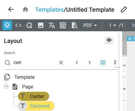
You can here search the design elements listed in section 10 for a specific text. All elements, that contains the search text (not case sensitive) are highlighted in the element list. You can click the marked arrow keys on the right after you have typed in a search text to jump between each of the search results:
You can also reset the search field, if you click the x-icon next to the search text.
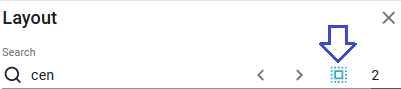
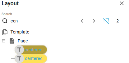
You can even select all the elements, that match the search criteria, if you click this icon:
After you have clicked this icon, then all the selected elements are marked in blue in the element list and you can e.g. change font settings for all the selected texts with a single click:
You can also search in the input sample file in the same manner:
Here the list of elements of your current design is shown. To edit the properties of an element you can either double click the element in the element list in section 10 or in the result view in section 11.
When you start editing design element you will find, that you often will use various XPath functions. There are many standard XPath functions available and there are even a lot of extra built-in XPath functions, that are also included in InterFormNG2. If you need help with finding the right XPath function and help will filling out the parameters, then you should check out the section, XPath wizard.
13. The ruler and measurements in the result view
A ruler is displayed around the result view. Markings on this ruler are shown whenever you select a displayable element like below:
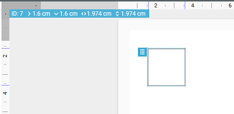
The indicators (smaller lines on the ruler) indicate the reference point of the currently selected element. On the top left corner you can also see the exact position and size of the element. In the image above you can see, that the frame element is placed 1.6 cm from the left and 1.6 cm from the top, it is 1.974 cm high and 1.974 cm wide. The position shown on the ruler and in the blue box are the actual position in the output, while in this case the position of the frame element is actually 1 cm from the top and 1 cm from the left. As the page element in this case has a 0.6 cm margin the frame is actually output in 1.6 cm from top and left.
If you prefer to work with inches in the designer, then you can set it on the designer settings.
This shows the result view of the merge between in the design elements and the input file. Notice however, that the result view have some limitations as all loops are not executed, so you will need to preview the result (section 4). Above and to the left of the result view a ruler is display for verification of the positions for the design elements.
15. Sidebar collapse and expand
In the top of the element list on the left you see this icon (on the top right of this window):

If you click this icon you can switch the setting of this window from being expanded to collapsed.
You will see the element list if the sidebar is expanded like below:
- and if the sidebar is collapsed the element list is hidden while there is more room for the result view:
You can expand the sidebar again if you click this icon:

More options can be found in the Designer section.